Associated with
4 min read
Create rich multi-layer visualizations in Oracle Analytics Cloud
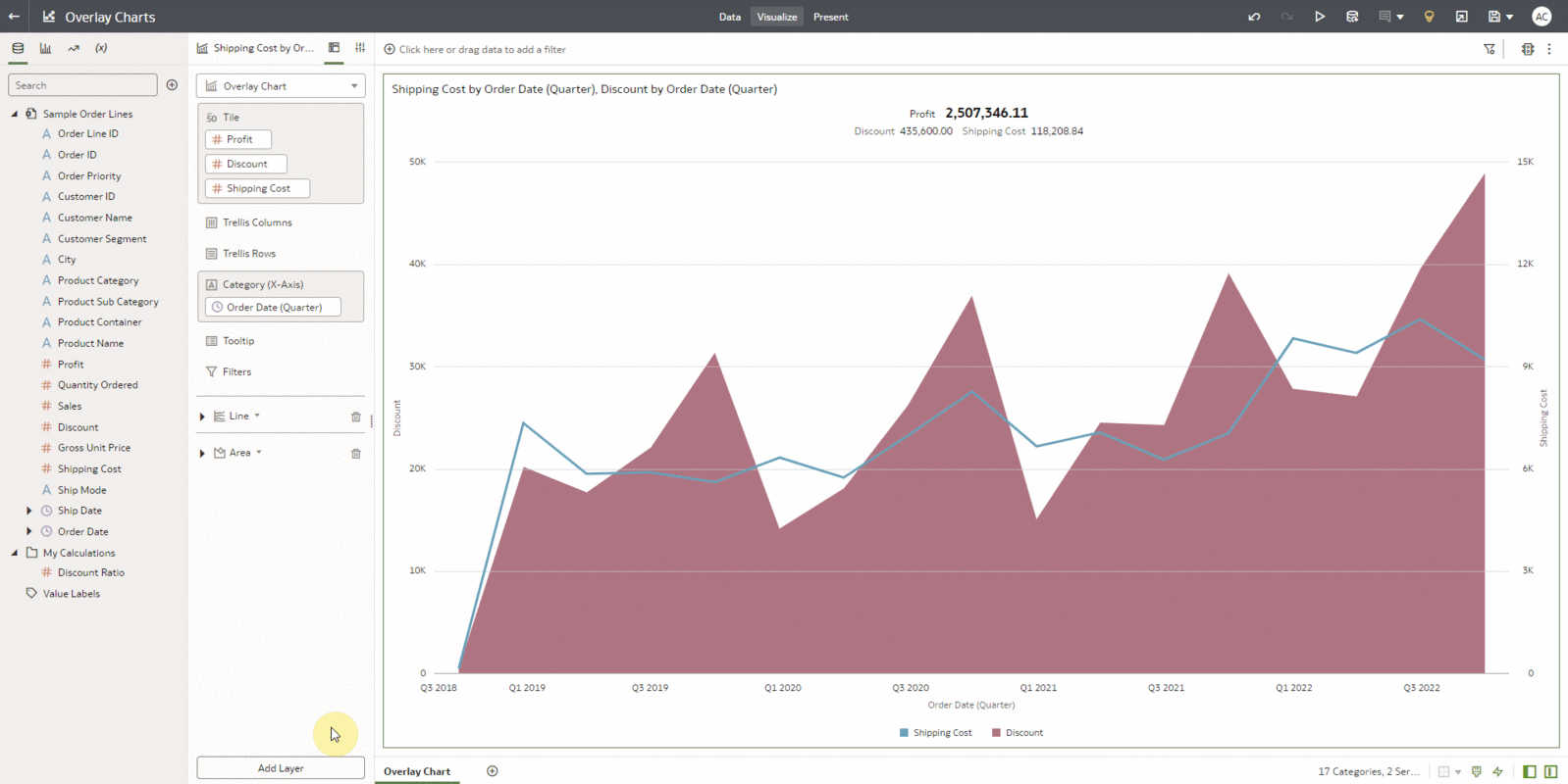
An overlay chart is one of the most versatile visualizations available in Oracle Analytics Cloud. It enables dashboard creators to present rich data through multiple different charts stacked in layers on a single visualization; thereby making the overlay chart a robust and powerful mode for visualizing your data.
More Ways to Read:
🧃
Summarize
--
The key takeaways that can be read in under a minute
Sign up to unlock

Worth the squeeze
Get access to the condensed version of this piece, and every other article on The Juice by AudiencePlus, and so much more.
Start a free account on The Juice and we'll send you weekly emails sharing which podcasts, blogs, guides,
etc. are trending with other marketing or sales pros. We call it the Top 5!
Other content from
Oracle


Featured by Simple Strat
