Associated with
Posted Jan 28, 2020
•
2 min read
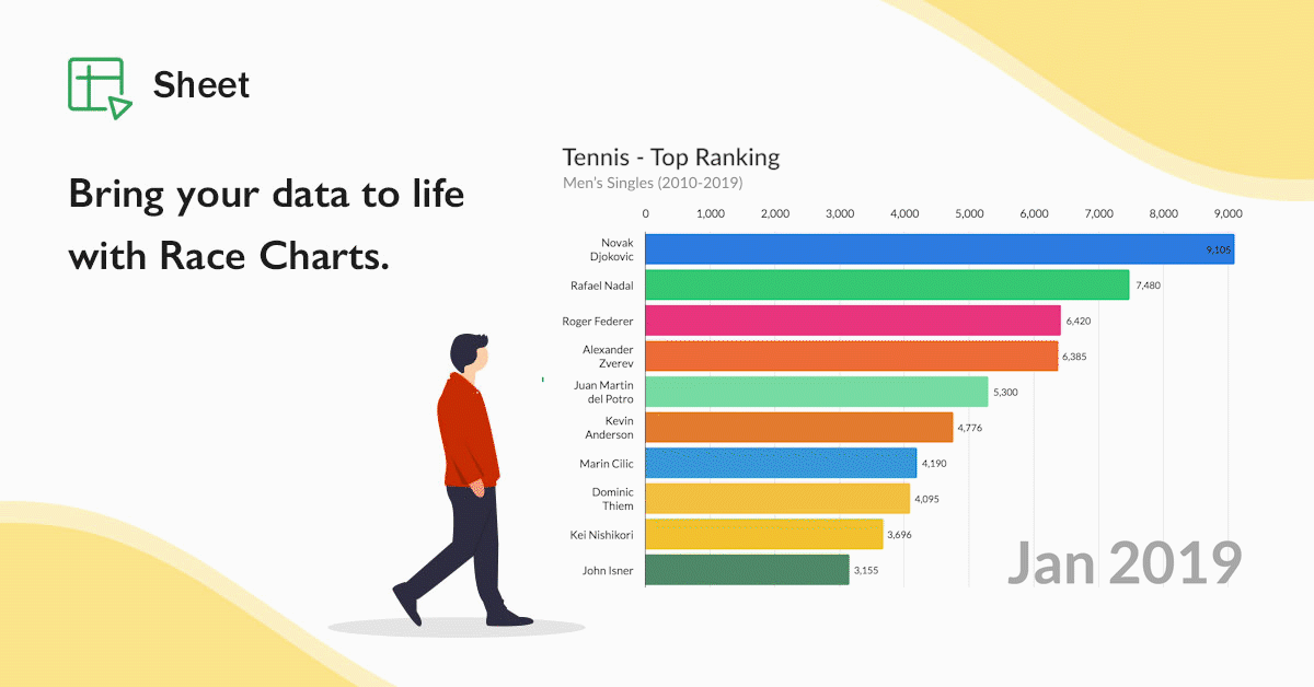
Visualizing data taken to new heights: Say hello to Zoho Sheet's Race Charts!
Data visualization has always been an integral part of making informative, engaging spreadsheets. While bars and pies can get the point across, you need something special to spice things up in your spreadsheet when you have a data set that spans across years or months. This is exactly what Zoho Sheet's new Race Charts can...
More Ways to Read:
🧃
Summarize
--
The key takeaways that can be read in under a minute
Sign up to unlock

Worth the squeeze
Get access to the condensed version of this piece, and every other article on The Juice by AudiencePlus, and so much more.
Start a free account on The Juice and we'll send you weekly emails sharing which podcasts, blogs, guides,
etc. are trending with other marketing or sales pros. We call it the Top 5!
Other content from
Zoho Corporation Pvt Ltd


Featured by Salesforce
