Associated with
Building a Marimekko chart in Oracle Analytics
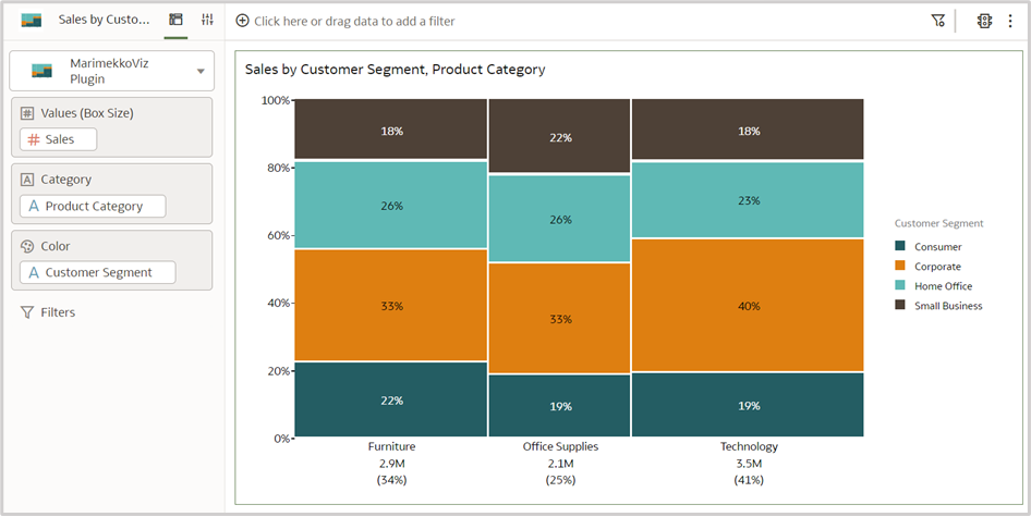
This article describes the plug-in and the steps for building a creative Marimekko chart in Oracle Analytics. A Marimekko chart (also known as a mekko chart or mosaic plot) is a powerful data visualization because it captures multiple dimensions in one chart. It combines a 100% stacked column chart and a 100% stacked bar chart. It's like a treemap with dimensional values represented by the length and width of each rectangle. The area of the rectangles is proportional to the value of the metric.
More Ways to Read:
🧃
Summarize
--
The key takeaways that can be read in under a minute
Sign up to unlock

Worth the squeeze
Get access to the condensed version of this piece, and every other article on The Juice by AudiencePlus, and so much more.
Start a free account on The Juice and we'll send you weekly emails sharing which podcasts, blogs, guides,
etc. are trending with other marketing or sales pros. We call it the Top 5!
Other content from
Oracle


Featured by Salesforce
