Associated with
4 min read
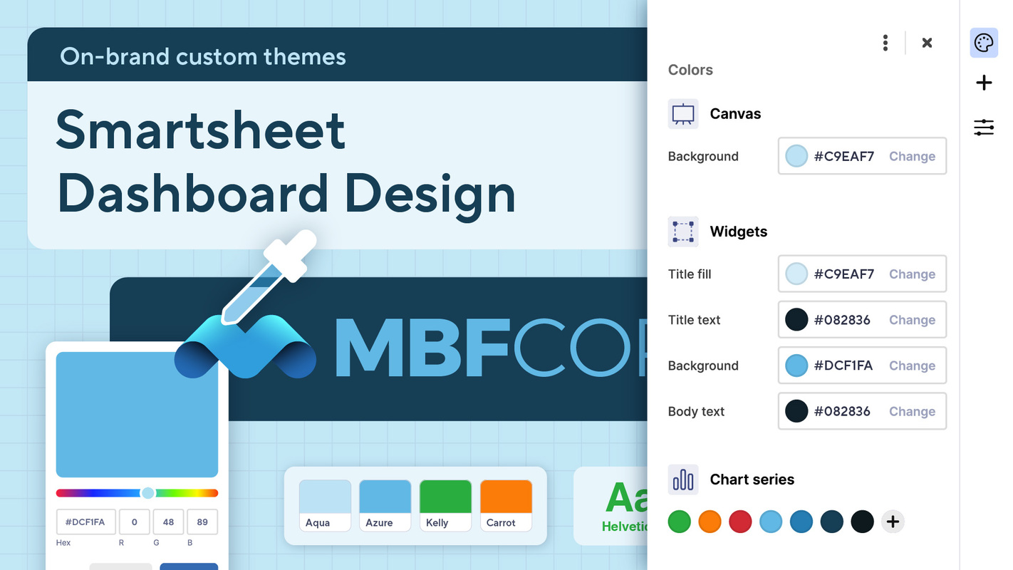
Smartsheet dashboard design: On-brand custom themes
In our previous blog posts on Smartsheet dashboard design, we explored the importance of effective layouts, strategic color use, and even some secret design tools to help you craft engaging dashboards.
Building on those fundamentals, this post dives into the world of custom color themes.
Creating a theme that aligns with your brand ensures consistency throughout your brand's ecosystem. It can make your dashboard more engaging and readable, truly elevating the effectiveness of your dashboards.
As a designer on the User Experience team, the following is how I would go about creating my own custom color theme.
More Ways to Read:
🧃
Summarize
--
The key takeaways that can be read in under a minute
Sign up to unlock

Worth the squeeze
Get access to the condensed version of this piece, and every other article on The Juice by AudiencePlus, and so much more.
Start a free account on The Juice and we'll send you weekly emails sharing which podcasts, blogs, guides,
etc. are trending with other marketing or sales pros. We call it the Top 5!
Other content from
Smartsheet


Featured by Seamless.AI
