Community
Posted Oct 26, 2017
•
1 min read
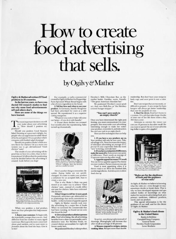
How to create food advertising that sells advertorial - Swipe File
This Ogilvy print was part of the famous "How to" campaign that showcased the Ogilvy's strategy and copywriting skills. Red areas are most likely to attract attention, followed by Yellow/Orange areas, and Blue areas. Areas that have no color overlay are unlikely to attract visual attention. The Regions Report graphically represents the likely...Read More
Other content from
Swipe Files
Featured by Salesforce


