Community
Posted Jul 10, 2017
•
1 min read
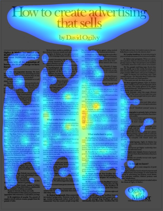
How To Create Advertising That Sells - David Ogilvy Ad - Swipe File
This is the classic Ogilvy & Mathew Ad. Ironically by giving away all their secrets they ended up making a ton of money off this magazine and newspaper ad! Red areas are most likely to attract attention, followed by Yellow/Orange areas, and Blue areas. Areas that have no color overlay are unlikely to attract...Read More
More Ways to Read:
🧃
Summarize
--
The key takeaways that can be read in under a minute
Sign up to unlock

Worth the squeeze
Get access to the condensed version of this piece, and every other article on The Juice by AudiencePlus, and so much more.
Start a free account on The Juice and we'll send you weekly emails sharing which podcasts, blogs, guides,
etc. are trending with other marketing or sales pros. We call it the Top 5!
Other content from
Swipe Files
Featured by Goldcast


